Apartment Therapy Takes a Tour of my New York City Apartment
Apartment Therapy reached out to me a few months ago after finding photos of my New York City apartment on Instagram. I was stoked. My apartment is an embodiment of my personality, the things/people/places I love and making it become a home has truly been a therapeutic process. I was thrilled to share it with Apartment Therapy and it’s readers. Photographer Chinasa Cooper came to my little Greenwich Village apartment to capture it and hear my story. This post was created for and originally published on Apartment Therapy.
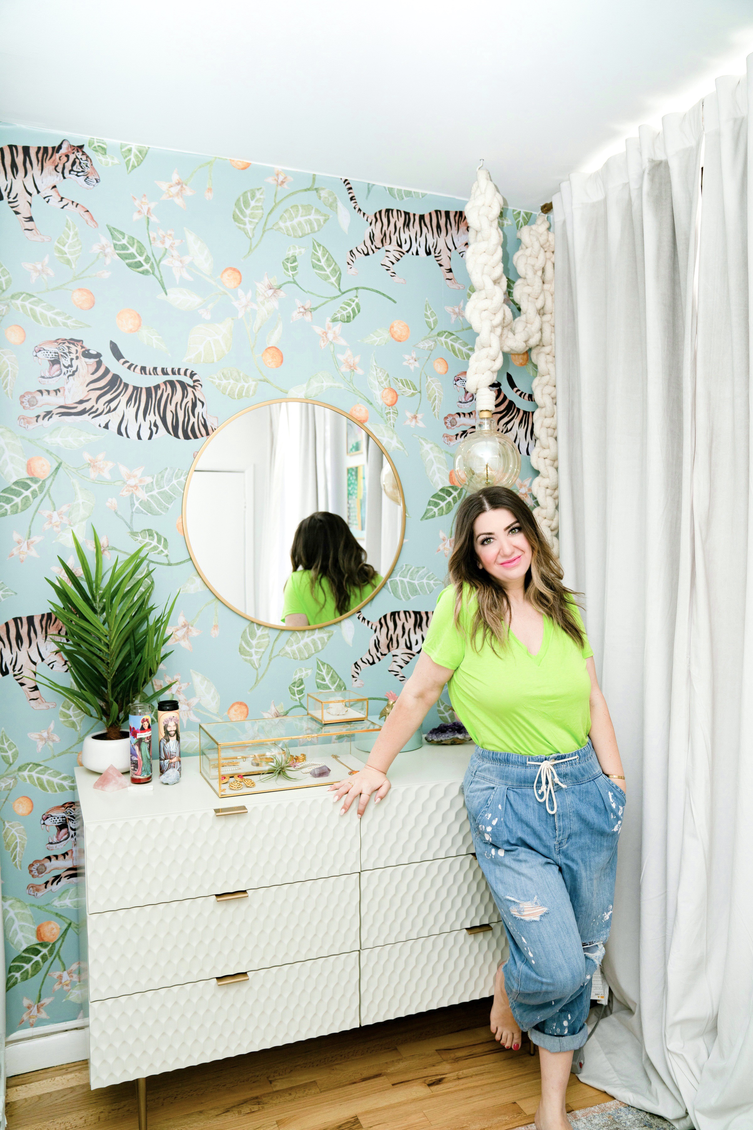
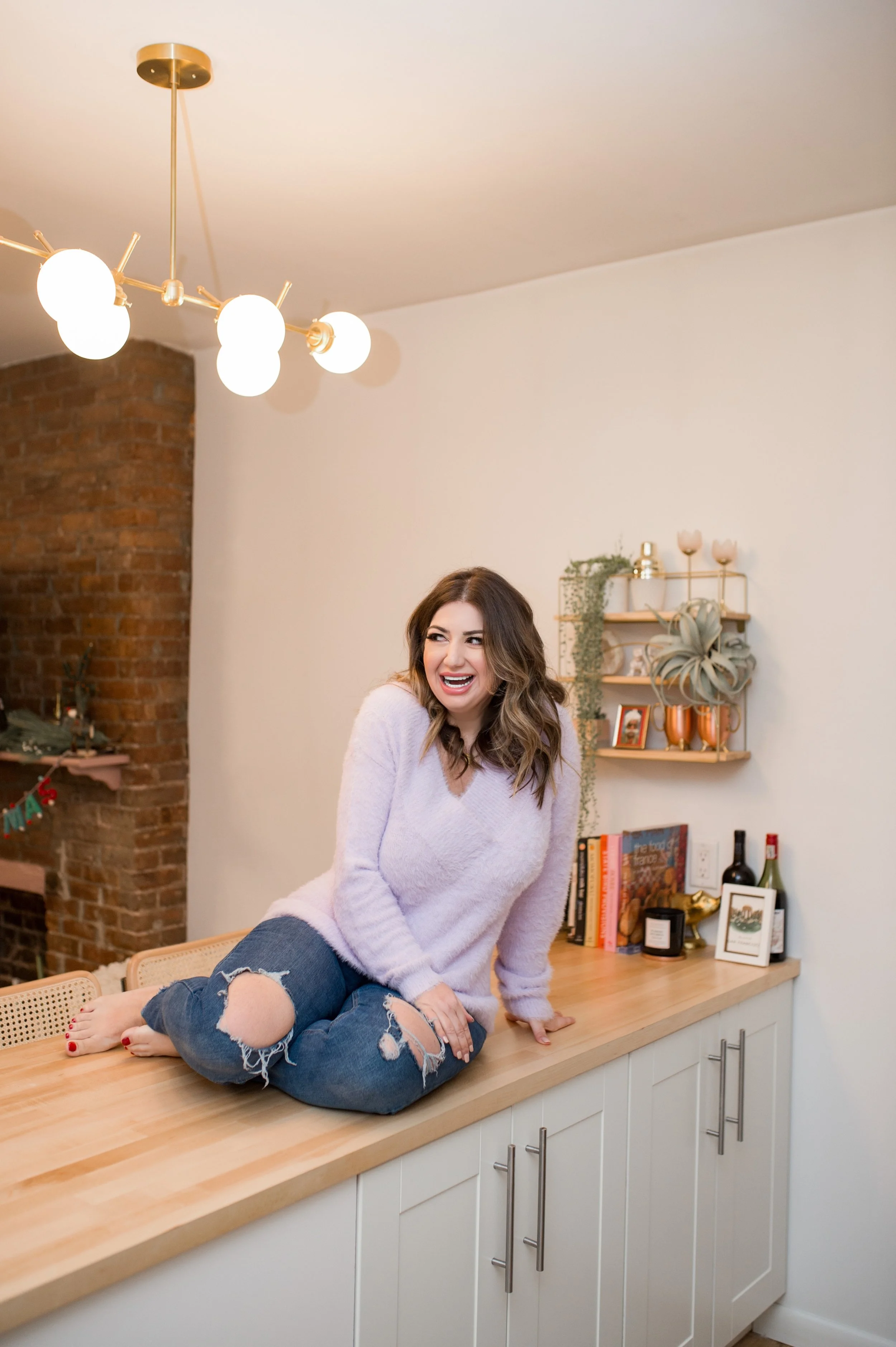
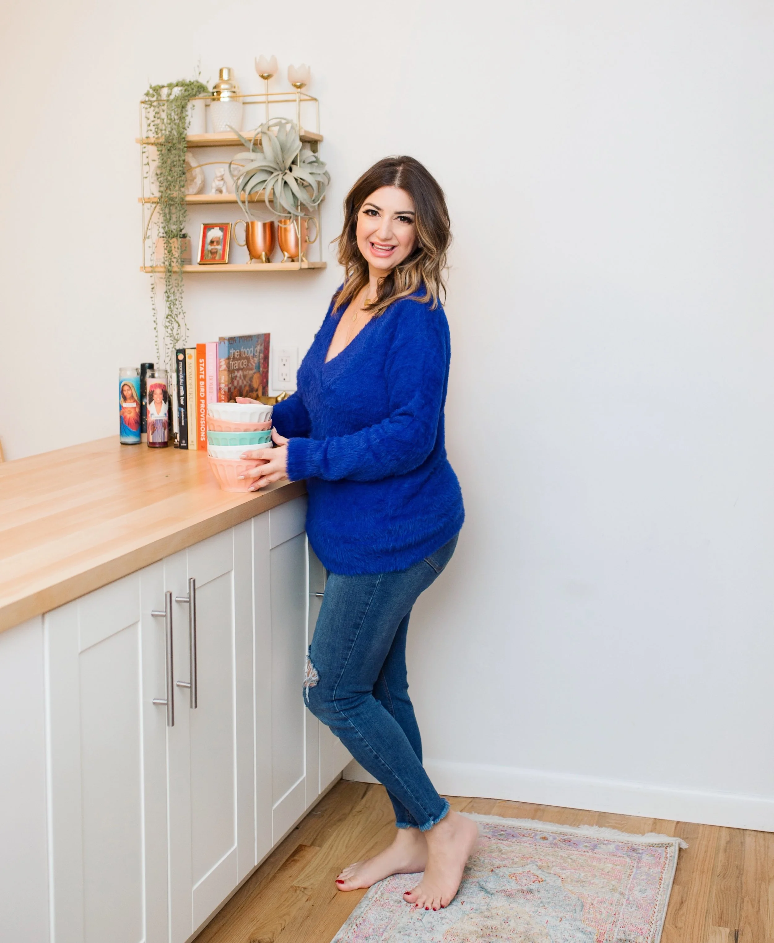
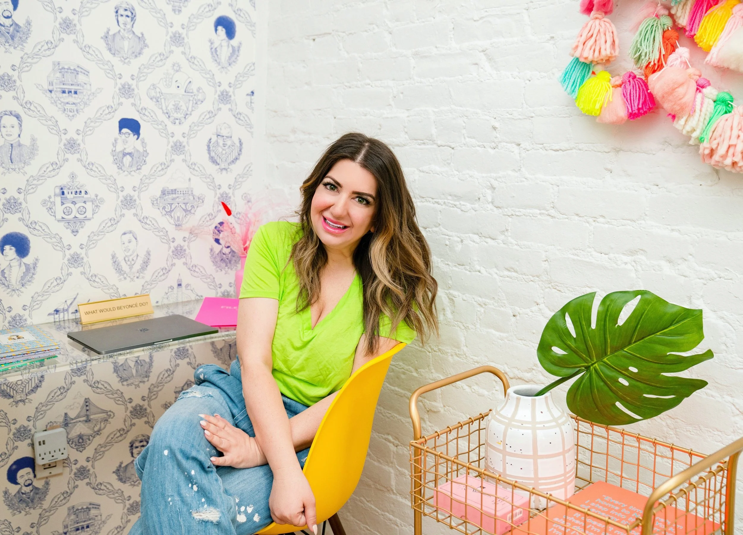
Mandy Ansari, founder of Girl and the Bay, found inspiration for her NYC apartment design from her favorite places: her birthplace of France, her hometown (the Bay Area), and her happy place (Palm Springs). (Image Credit: Chinasa Cooper)
This Cozy New York Apartment’s Decor Was Inspired by Three Important Places
Name: Mandy Ansari
Location: Greenwich Village — Manhattan, New York City
Size: 850 square feet
Years lived in: 1 year, renting
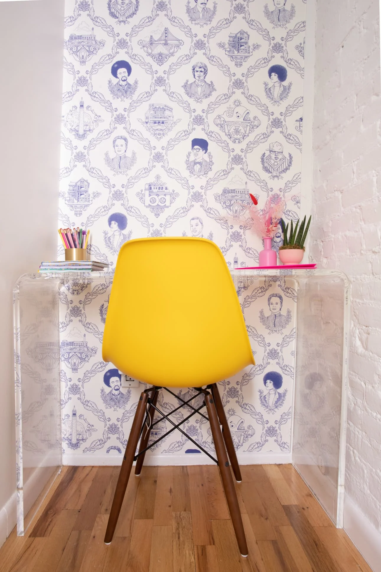
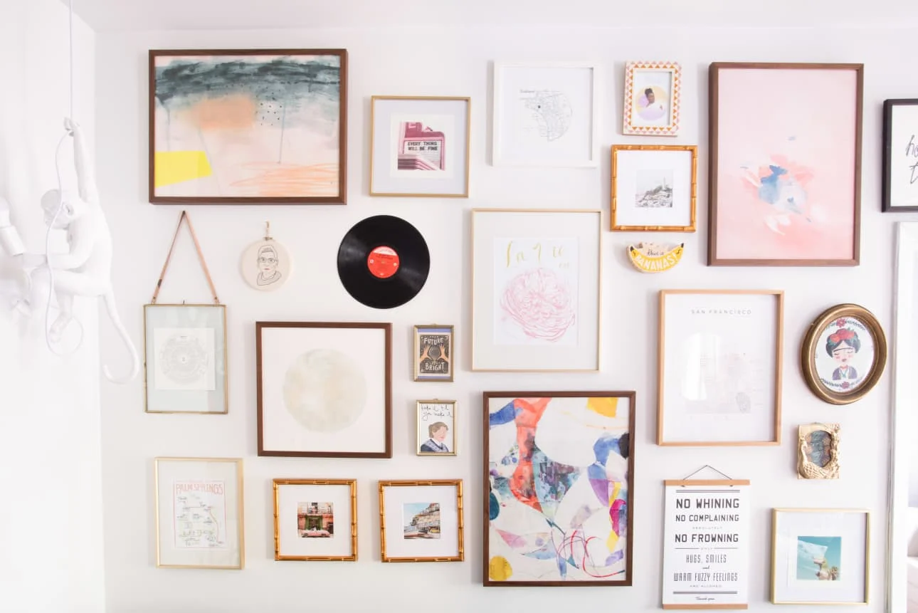
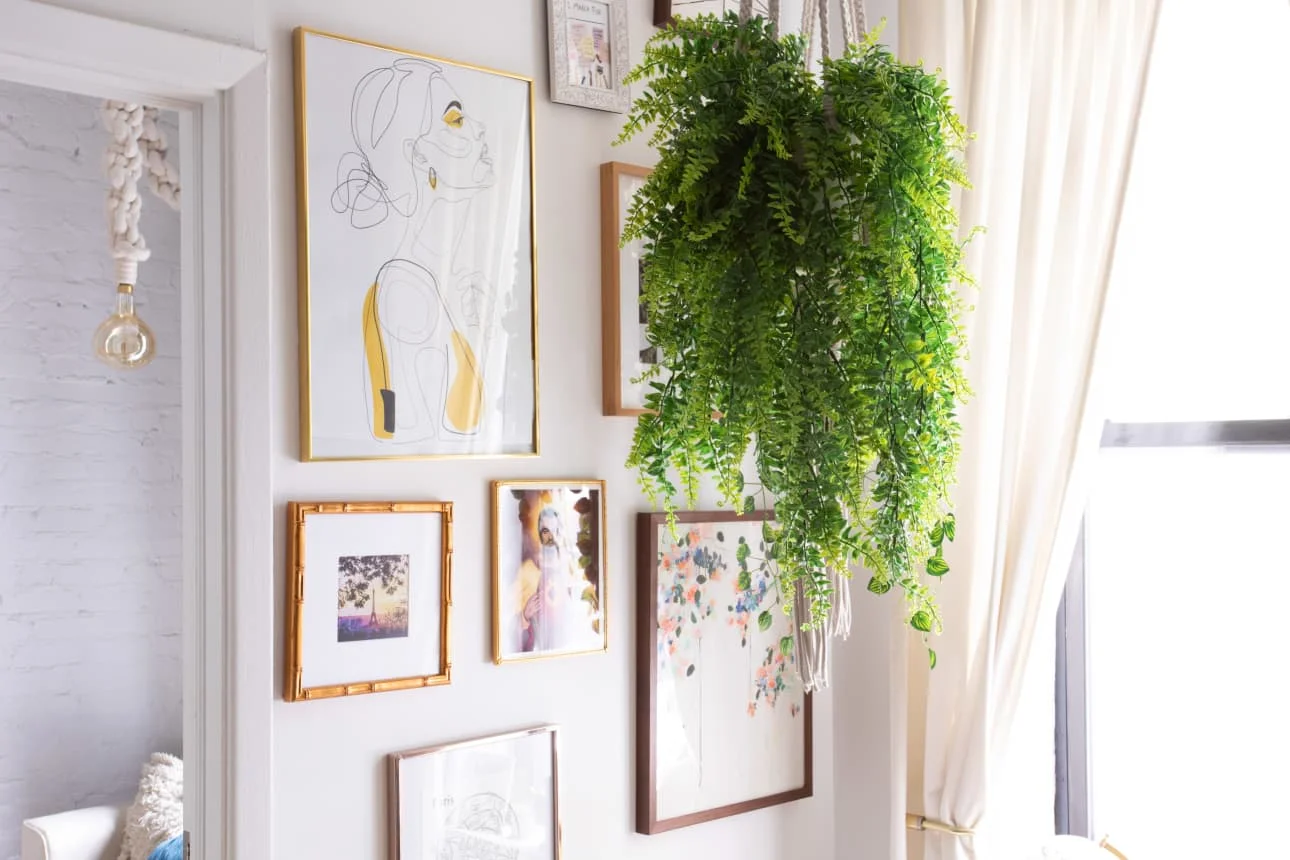
Mandy Ansari is the founder of Girl and the Bay, a blog dedicated to helping others “chase their happiness.” She’s designed her apartment to evoke three places that are near and dear to her heart: her birthplace of France, her hometown (Bay Area), and her happy place (Palm Springs). These locations have inspired the design in her apartment; elements of these places can be found in the “colors, prints, textures, wallpaper, or plants” within the apartment. The wallpaper in her office features inspirational and significant figures from the Bay Area. Her kitchen chairs were inspired by a rocking chair from her childhood home in Oakland. And a gorgeous gallery wall [Mandy’s proudest DIY] features photos and maps from the places she’s traveled to.
In capturing these locations in the design and decor, Mandy shares part of her story with anyone who walks through the door. One friend described the apartment as “a museum of trinkets and things that I see in cutesy gift stores and want to buy, but think ‘I don’t have a use for this’.” For Mandy, that comment sums up her approach to decorating. “If something feels like ‘me,’ I’ve got to have it,” she says. “I love that my space feels like an embodiment of my personal brand. It’s my first place on my own without roommates and it should feel and look like ME.”
When decorating a home, Mandy has three tips: “comparison is the thief of joy”, “good things take time”, and use “the process of elimination” to understand what you don’t like and hone in on what you do (see survey below for more depth).
Apartment Therapy Survey:
My Style: Mid-Century Color Chic
Inspiration: Home is where the heart is and for me, my heart is in many places. A piece of my heart forever belongs to France (my birthplace), a big chunk is with the Bay Area (I grew up in Oakland and moved to Manhattan from San Francisco), and my happy place is Palm Springs. All three of these locations inspired me. Whether it be colors, prints, textures, wallpaper, or plants—I wanted to make sure there were elements representing the places I love to help make my New York City house (errr, apartment) a home.
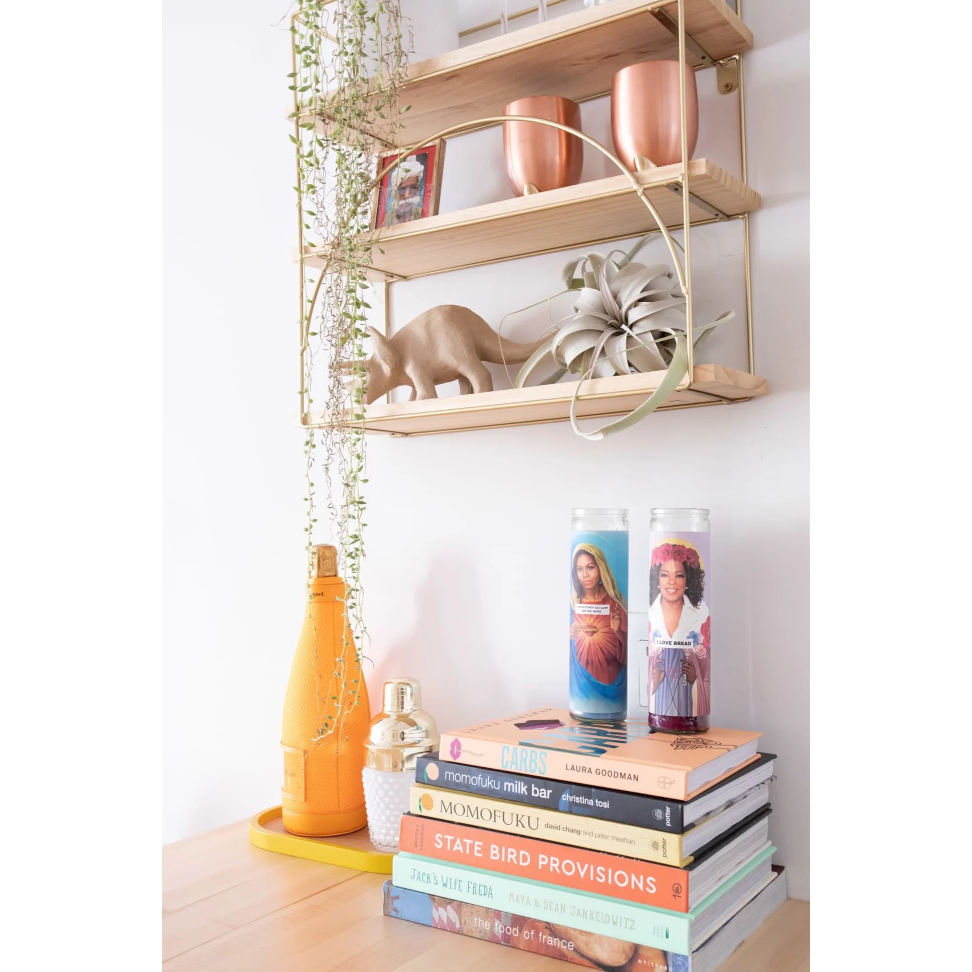
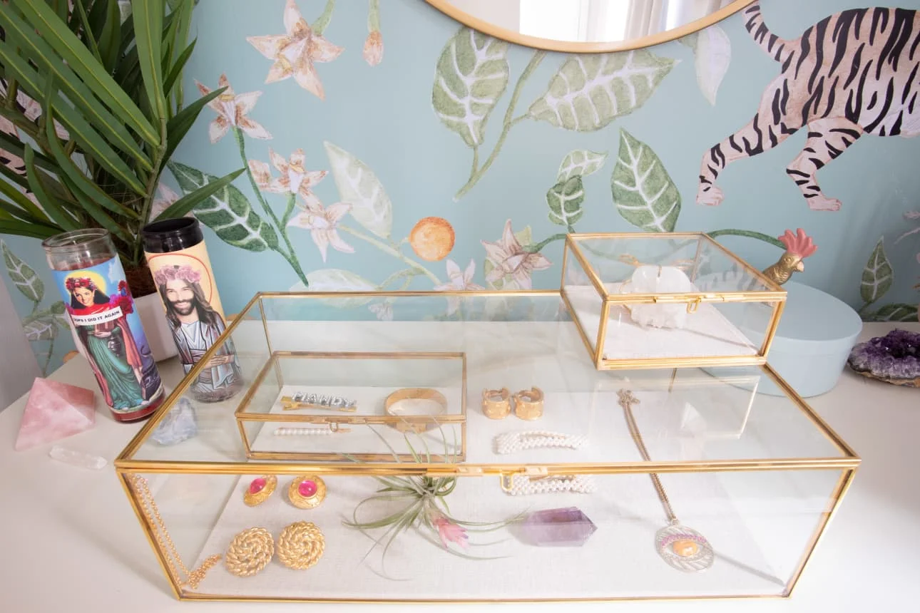
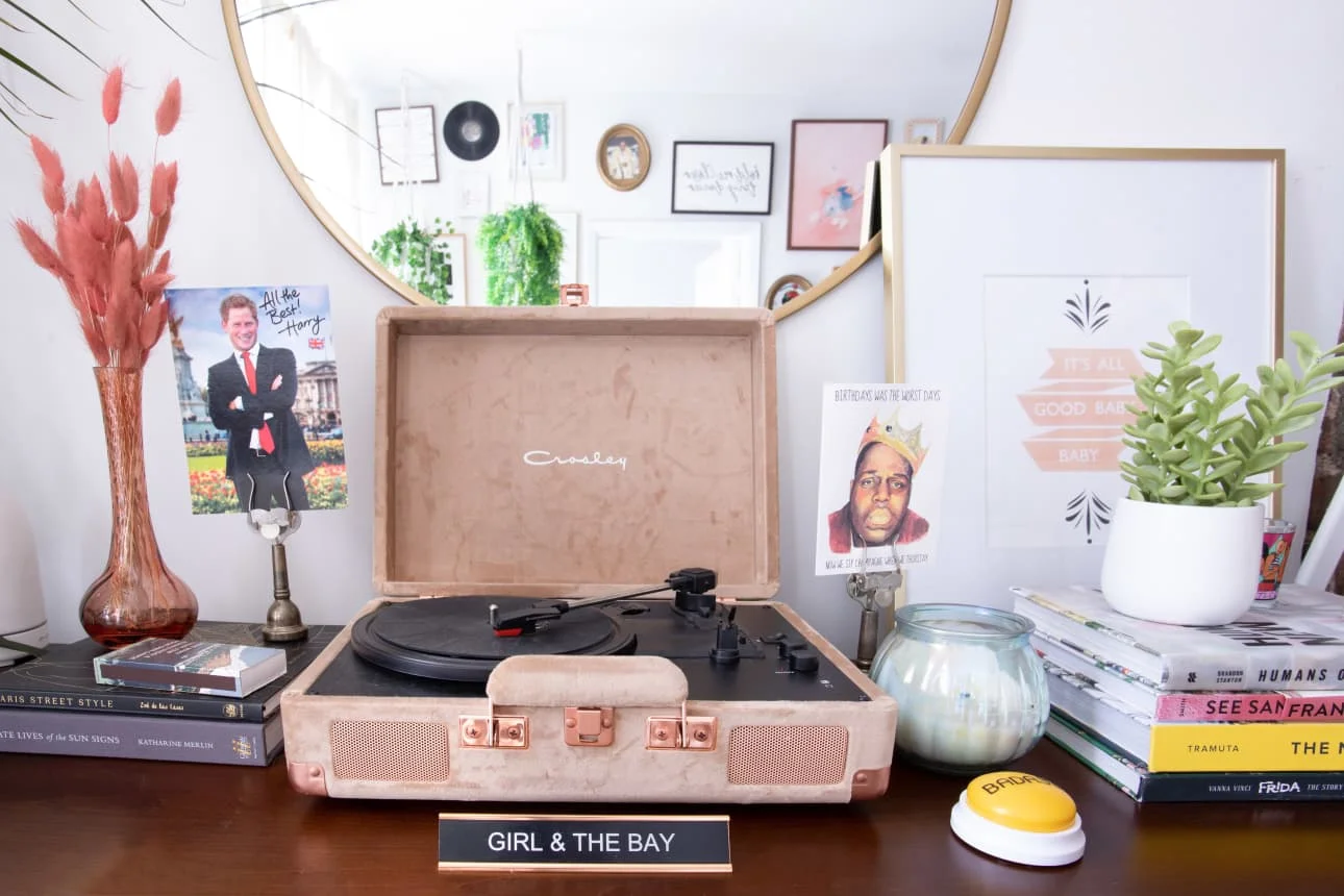
Favorite Element: There are so many things I love about my apartment decor because I truly collected and thoughtfully curated each piece. From the oversized macrame rope lights in my bedroom and office, my Michelle Obama candle, Leonardo DiCaprio Jesus, and “Mrs. Doubtfire” prints, to the Bay Area Toile wallpaper from Flavor Paper in my office/guest room space—it’s hard to pick just one piece!
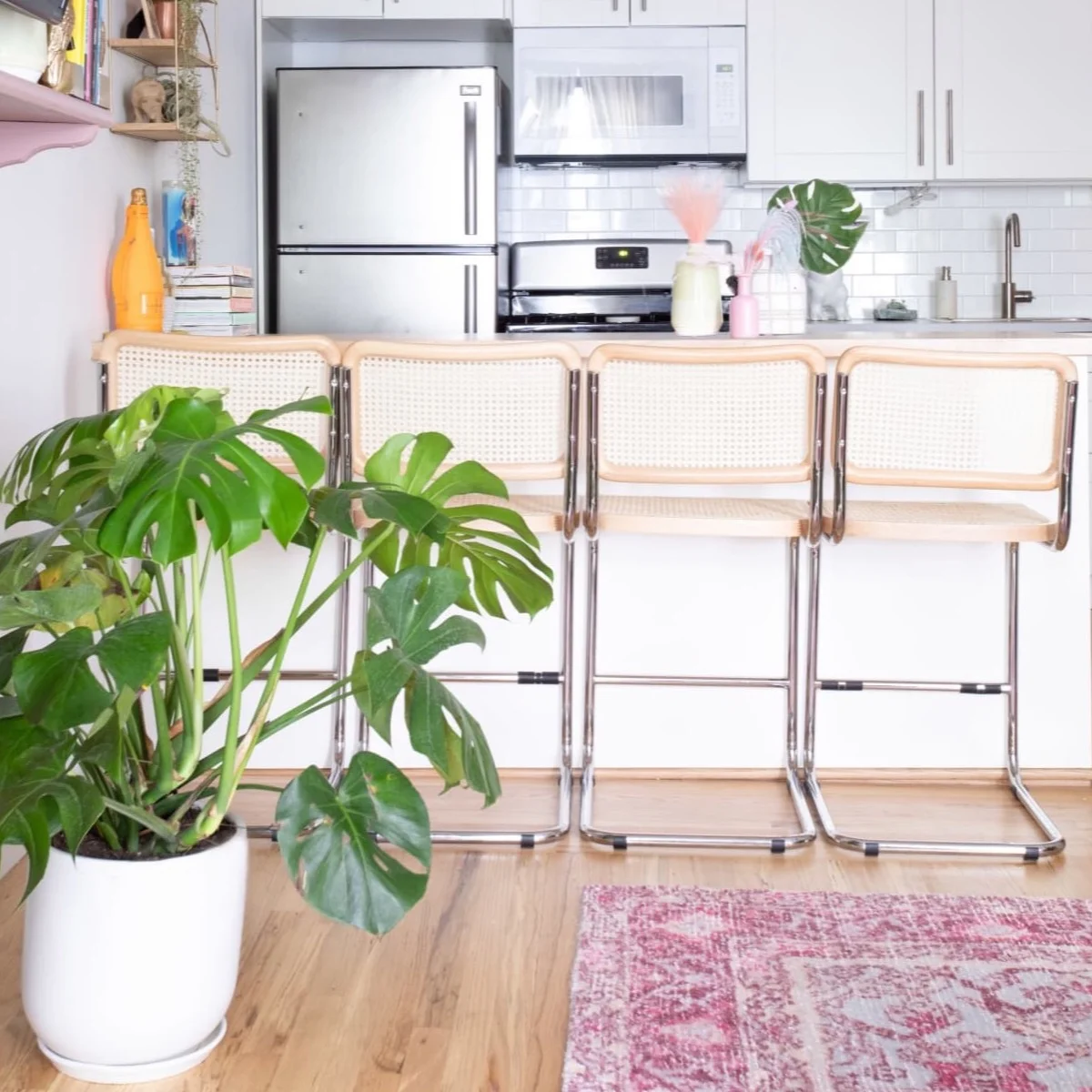
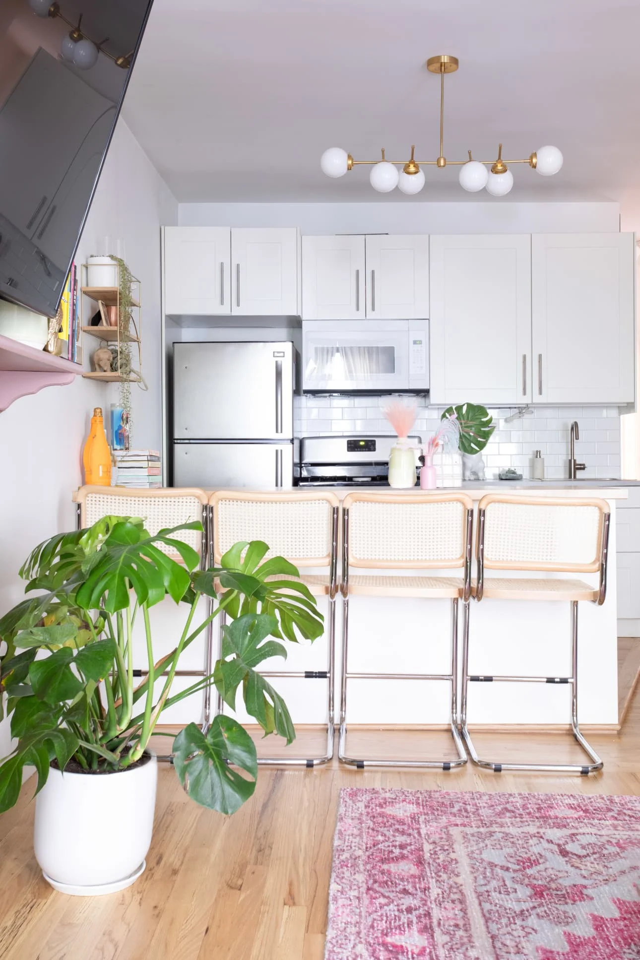
Biggest Challenge: I truly feel so at-home and thankful for my space, but not having a dining table can be a challenge because I love cooking, entertaining, and hosting. That’s why I was intent on making use of my kitchen counter space and utilizing it as an island. Growing up, my dad would always sit on a rocking chair we had picked up on the side of the street in Oakland for free. When we eventually moved out of my childhood home, I was so sad we parted with that treasure. It was a cane Breuer rocking chair and I always wanted to have a similar piece when I was old enough to have a place of my own. I searched high and low to find stools that were affordable, yet the classic Breuer style. I was so happy to find four beautiful pieces that looked just like the rocking chair I had as a child, but with a modern twist.
What Friends Say: Friends always make comments that my apartment is as colorful as my personality, and that looks like an embodiment of my Pinterest boards. My favorite recent comment by a friend: “Your apartment looks like a museum of trinkets and things that I see in cutesy gift stores and want to buy, but think ‘I don’t have a use for this.’” I think that comment perfectly sums up my sense of joie de vivre. If something feels like “me,” I’ve got to have it. I love that my space feels like an embodiment of my personal brand. It’s my first place on my own without roommates and it should feel and look like ME.
Biggest Embarrassment: Definitely the fact that each closet requires extra force (literally, you’ll need to put your back into it) to close. Lord help the person who opens up one of my closet doors because this New York City apartment’s every nook and cranny of storage is filled to brim.
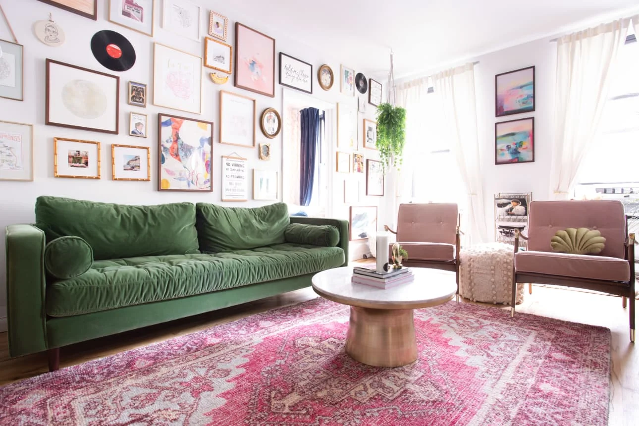
Proudest DIY: DEFINITELY my living room gallery wall. I had a vision of creating a floor-to-ceiling gallery wall that had a certain je ne sais quoi. I’m a big ball of organized chaos, so the perfect gallery wall was very much imperfectly perfect in my head. I love that people notice something new every time they look at this wall. I have everything from my parent’s favorite records to photos I’ve taken on my travels to framed greeting cards making up my wall of art. There is so much happening on this wall, but the simple white backdrop makes every piece feel very deliberate and the entire wall somewhat organized. The mixed mediums create a great layered sense of texture on the wall, and I love that the gallery is floor-to-ceiling and incorporates the furniture so it flows seamlessly with the room.
Biggest Indulgence: I wanted to invest in a dresser that would withstand the test of time (aka me stuffing each drawer with as much clothing as humanly possible). I loved my bedroom set in San Francisco, but it didn’t make financial sense to move it cross-country. My mom was in need of a new set and luckily the bed, dresser, and nightstand I had fit her needs perfectly. In exchange, she surprised me with a version of the same dresser that would work for my new space. It was a lovely housewarming gift that I would have had a hard time purchasing myself (moving into a new space in Manhattan isn’t too easy on the bank account) upon moving in.
Best Advice: We live in a time where entire homes appear to be completely redecorated in the span of one TV show and blogs make DIY projects look super easy and totally affordable. My best advice is broken into three tips:
Comparison is the thief of joy: Don’t compare your square footage, budget, speed, or taste to anyone else. It’s easy to get discouraged when you compare and that’ll take the fun out of the decorating process. It’s not every day you move into a new place or have a chance to redecorate. Don’t rob yourself of the joy that comes with the process.
Good things take time: Creating a home is like a never-ending love story. Allow yourself time to find those special pieces. Don’t make hasty decisions. Don’t cut corners because you’re pressuring yourself with an unrealistic timeline to finish the process. Allow yourself space to let your style evolve (I intentionally left blank spaces on my gallery wall because I knew I’d see prints in NYC that I would want to add. I still have some open spaces and I’ve also filled up a few).
The process of elimination: It’s so much easier to express what you dislike than what you like. When you make a list of the things you dislike, you can easily eliminate and hone in on your personal aesthetic. For example, an abstract print might remind you of something in your childhood that you don’t want in your own space, or a leather chair might bring back memories of being sent to time-outs for annoying your little cousin. In the same way, a certain material might evoke feelings of nostalgia that are important for you to feel cozy. These memories and reactions are super personal and unique, but are what make up your decor aesthetic.
Resources
LIVING ROOM
Sven Sofa — Article
Marble Top Pedestal Table — West Elm
Velvet Haverhill Chairs — Anthropologie
Media Stand — All Modern
Fuchsia And Aqua Persian Style Amira Area Rug — World Market
Candlesticks — Collected from Flea Markets, Thrift Stores and Travels
Round Decorative Mirror – Target
Macramé Hanging Plant Holders – CB2
Gallery Wall Frames – Minted, Framebridge Instagram Frames (So fun! I printed images straight from my Instagram Account) for corners to frame the wall in clean lines – everything inside the borders is thrifted (collected from Brooklyn Flea, Grand Bazaar NYC, Housing Works)
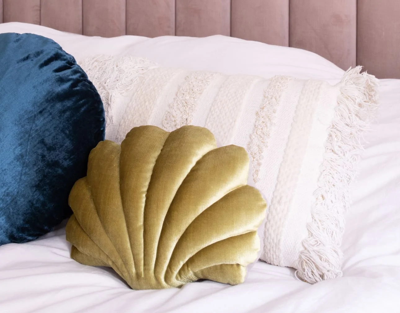
Velvet Seashell Pillow — Adaptations NY
Hanging Monkey Light — Wayfair
Vega Brushed Light Fixture — CB2
KITCHEN
Bar Stools — Seats & Stools
Austin Light Fixture — Illuminate Vintage
Dinosaur Cookie Jar — Adaptations NY
Lauren Wall Shelf — Urban Outfitters
BEDROOM
Avalon Channel Stitched Velvet Bed — PB Teen
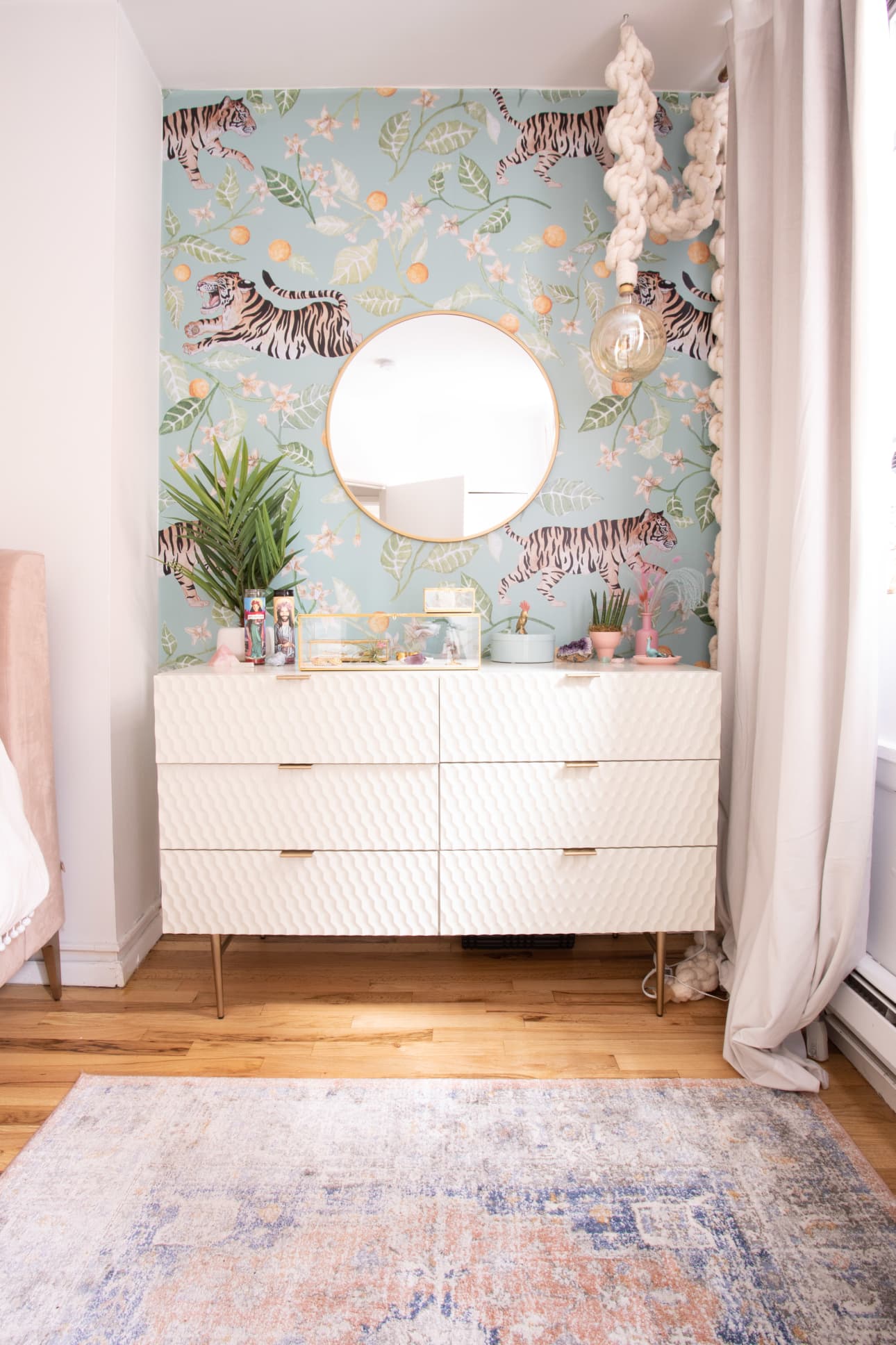
Macramé Rope Light — Mission Loft
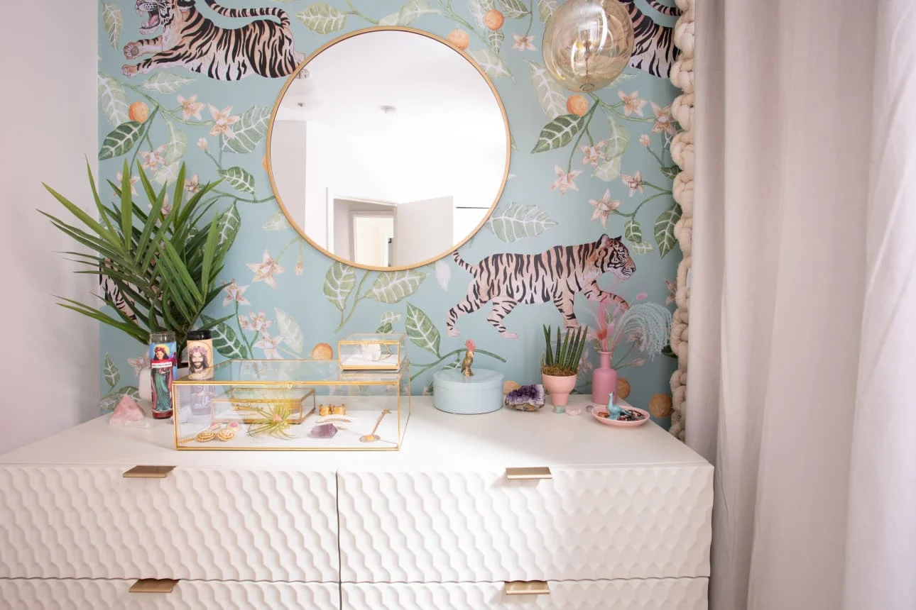
Clementine Tiger Wallpaper — Anewall
Audrey 6 Drawer Dresser — West Elm
Mendelsohn Vintage Persian Rug – Rugs USA
Round Decorative Mirror – Target
OFFICE
Acrylic Desk — CB2
Macramé Rope Light — Mission Loft
Bay Area Toile Wallpaper — Flavor Paper
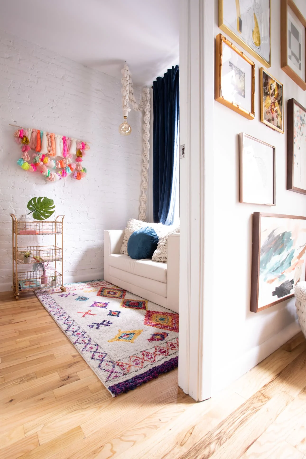
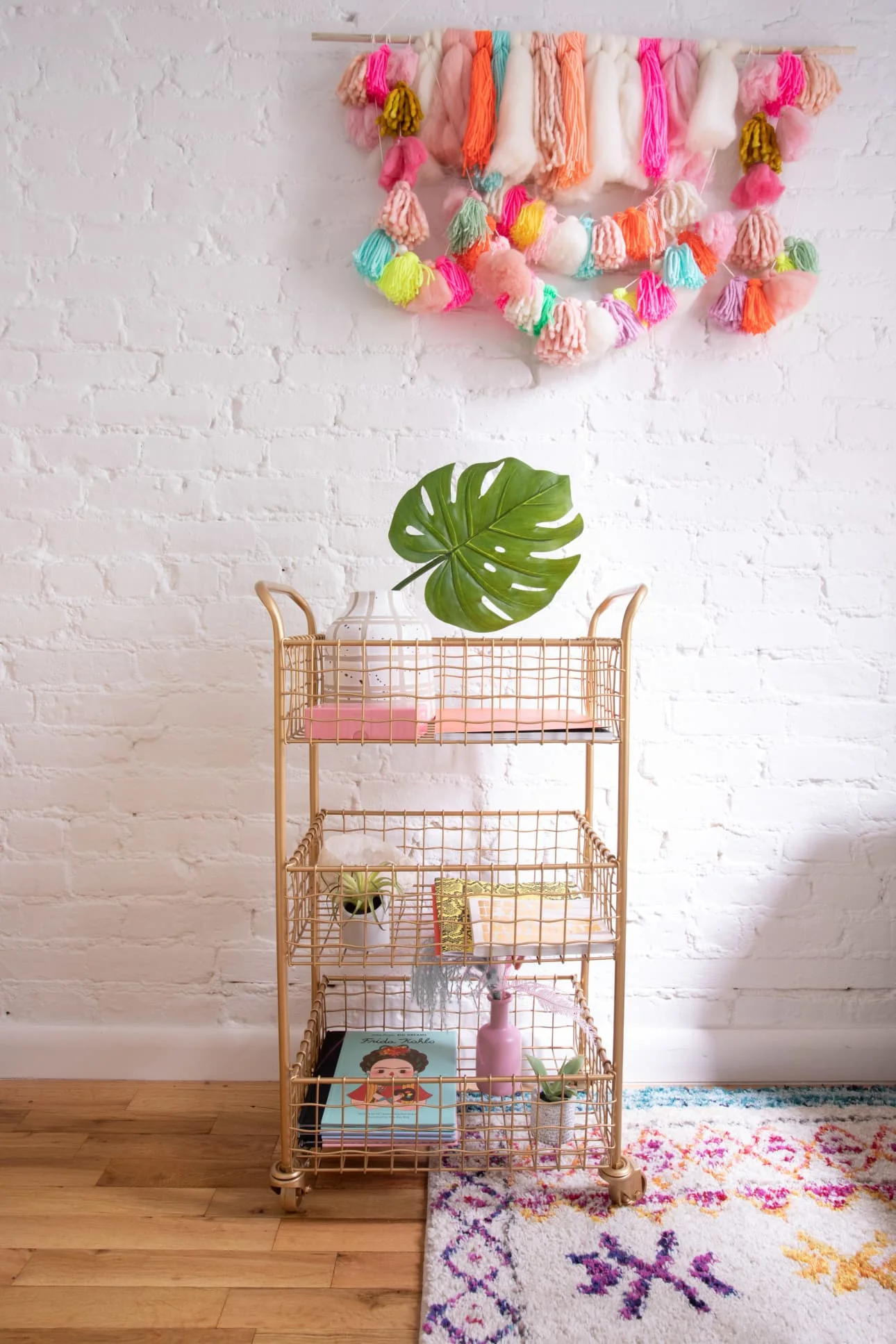
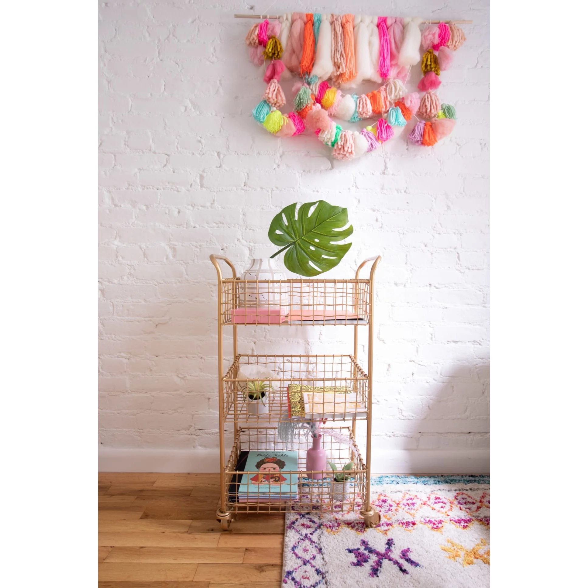
Neon Woven Wall Hanging — Shop Leo Kids
Eames Chair — Poly & Bark
Circle Wall Shelf — Target
Navy Velvet Curtains – Amazon
Twin Sleeper Sofa – Wayfair
Cozy Rainbow Morrocan Rug – Urban Outfitters
Gold Wire Rolling Cart – World Market
BATHROOM
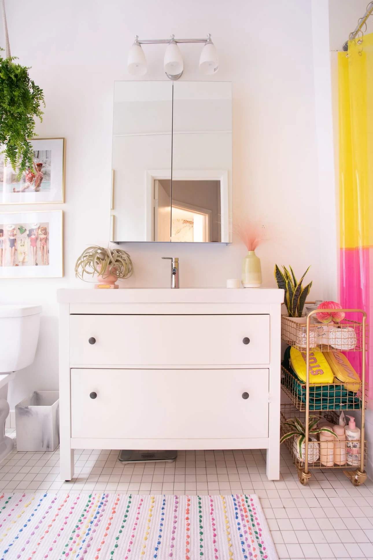
Gold Wire Rolling Cart – World Market
Neon Shower Curtain — Quiet Town Home
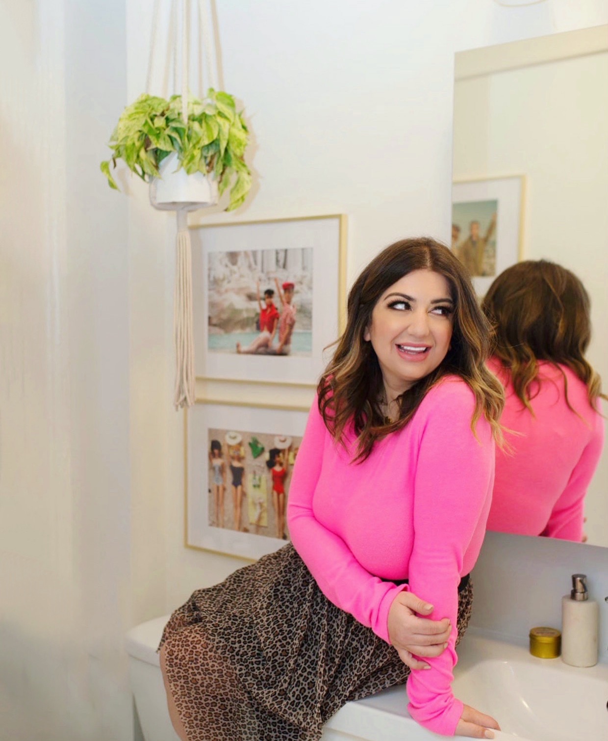
Macramé Hanging Plant Holders – CB2
Vintage Barbie and Ken Prints — Vintage Barbie and Ken
